The Building Design Class was this year's most popular category, with more than 100 entries across the eight awards. Here are details of this year's winners
Award for Best Acute Hospital Development
The judges considered
- David Morley Architects for the Kent Institute of Medicine & Surgery
- Capita for the Montagu Hospital rehabilitation unit
- Paul Murphy Architects for Basingstoke and North Hampshire Hospital new private patients facility and radiotherapy unit
- The Manser Practice for the Barnsley Hospital clinical decisions unit
- Ove Arup for Colchester General Hospital radiotherapy redevelopment
- Miller and Galliford Try for the South of Tyne pathology 'bigger picture' project
Winner:
David Morley Architects for the Kent Institute of Medicine & Surgery
The prize for Best Acute Hospital Development was presented to David Morley Architects for the Kent Institute of Medicine & Surgery (KIMS).
The £95m hospital development opened in April and will transform acute and specialist healthcare services in the county.
The independent, patient-focused, clinician-led facility is the first and only tertiary care centre in the area and boasts one of the largest cardiology departments in the UK. It will provide high-quality complex procedures and acute care in areas such as cardiology and cardiac surgery, neurology, neurosurgery, complex orthopaedics and surgical oncology services.
Designed to create an environment for learning, knowledge sharing, clinical education and best practice, the 15,000sq m building has 74 inpatient beds, including seven chemotherapy rooms, plus 20 day care beds, seven intensive therapy unit beds and high dependency facilities.
Constructed by VINCI Construction UK, KIMS mirrors the quality and design flair of a boutique hotel, promoting health and wellbeing through the use of natural materials, maximum daylight and attractive landscaping.
Therapy gardens, green roofs and innovative green walls encourage biodiversity and enhance patient views. Natural light has been maximised and views to the surrounding rich landscape are encouraged. The scheme is on target to achieve a ‘very good’ BREEAM sustainability rating.
Choosing the project as their winner, the judges praised the ‘simple and rational layout’. They said: “The facility has developed into a design whose clarity and humanity should be of benefit to both patients and staff.
“The approach from parking is sheltered and pleasant and the clear main entrance is welcoming. Internally, the layout is clear and the environment is bright and positive. The use of colour is restrained, but effective.”
Highly commended:
Paul Murphy Architects for Basingstoke and North Hampshire Hospital new private patients facility and radiotherapy unit
Basingstoke and North Hampshire Hospital’s new private patient and radiotherapy unit was given a commendation after being described as a ‘welcoming and human building’ by the judging panel.
The facility will provide interim cancer treatment while the hospital plans a new permanent facility off site.
The building provides 12 consulting rooms and support accommodation including an X-ray unit with an MRI scanner.
A separate-but-linked radiotherapy unit also contains state-of-the-art equipment including a CT scanner and linear accelerator.
Using modular construction methods, the facility has a double-height entrance with views of the outside and internal courtyards.
Consulting rooms inhabit the perimeter of the building, arranged in pairs around shared offices, with the central section given over to support rooms. A series of themed internal courtyards punctuate the plan to bring natural light into the heart of the building and to animate waiting areas and aid orientation.
The judges said: “This is a development with nice proportions, which retains a lightness and a human scale.”
The Manser Practice for the Barnsley Hospital clinical decisions unit
The redevelopment at Barnsley Hospital provides a 10-bed clinical decisions unit (CDU) with the aim of improving clinical services and shared facilities adjacent to the hospital’s existing emergency department.
In addition to the new ward, the redevelopment also included the creation of additional shared facilities with the emergency department, minor works to the fracture clinic, and the expansion of the adjacent resuscitation suite to increase the provision from three to five bed bays, including a paediatrics bay, and to allow more natural light into the suite.
The main design objective was to create a fully-functioning and efficient ward layout that maximised observation of all 10 patients while working within the constraints of the existing 1970s structure. This has been achieved by employing a centralised nursing base around which all bedrooms and other facilities are arranged. This not only allows patients to be observed by the hospital staff, but gives the patients a visual link back to the nurses.
The unit’s clear separation from the emergency department creates a sense of privacy and dignity, while still providing the observation levels expected. All construction works were carried out in phases to minimise disruption to the existing hospital.
The judges said of the project: “This innovative redevelopment has been carried out sensitively and has made the most of the opportunities presented.”
Artwork for the building was supplied by Artinsite.
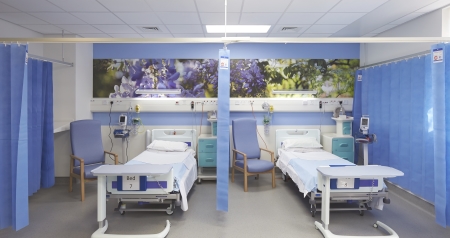
The Manser Practice was highly commended for its work on the Barnsley Hospital clinical decisions unit
Award for Best Primary Care Development
The judges considered:
- Abacus Architects and Lion Health for Lion Health Centre
- Penoyre and Prasad for the Sir Ludwig Guttmann Health & Wellbeing Centre
- Barbara Weiss Architects for Wokingham Medical Centre
- SR Architects for Cranleigh Medical Practice
- Capita for Cynon Valley Community Hospital
- Apollo Capital Projects for Rumney Medical Centre
Winner (New build):
Penoyre and Prasad for the Sir Ludwig Guttmann Health & Wellbeing Centre
The initial purpose of the Sir Ludwig Guttmann Health and Wellbeing Centre was to provide outstanding primary care, specialist physiotherapy support, and drug sampling facilities for the athletes and officials of the London 2012 Olympic and Paralympic Games.
More importantly, the primary and long-term aim was to provide a building capable of swift adaptation to suit the needs of the new local clinical commissioning group which wanted to bring together a range of healthcare and wellbeing services including GP practices, a pharmacy, community and outreach services, and social enterprise schemes.
In keeping with the ethos of the Games, excellence in design and service were paramount, together with a strong commitment that the physical activities of the Games would be used to inspire a future wellbeing agenda.
The resulting design is one that maximises access to natural light, offers good views to the outside, and promotes simple wayfinding for visitors and staff alike. The use of the building to serve the Paralympics also brought a new level of rigour to the design process for inclusion, with the architects analysing each space and route in terms of a range of disabilities.
Sarah Drake or Penoyre and Prasad said: “The relative smallness of this building in relation to its towering residential neighbours convinced us of the need to create a dynamic and eye-catching form as a landmark statement from an important local civic building.”
The judges added: “The building is bright and airy, with a strong presence on the street and an optimistic air. This is an absolutely beautiful development.”
Artwork for the building was supplied by Artinsite.
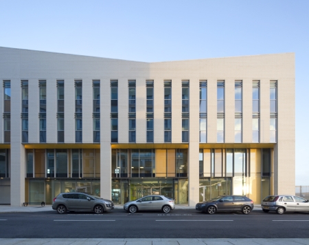
Penoyre and Prasad won the Award for Best Primary Care Design for the Sir Ludwig Guttmann Health and Wellbeing Centre
Winner: Refurbishment:
Barbara Weiss Architects for Wokingham Medical Centre
“Created out of an unremarkable 1980s office block, the new centre is at once stylish and welcoming, flooded with light, and with spaces that are simple and clinical, yet remain humane.”
This comment from the judging panel sums up the impact of the new Wokingham Medical Centre.
Formerly the oldest and largest GP practice in town, Wokingham Medical Centre announced expansion plans after seeing registrations increase due to new homes being built in the area.
The main aim was to combine under one roof a practice that had been operating from two distinct sites, allowing expansion and accommodation of new services, improving access for mobility-impaired visitors, and creating a state-of-the-art facility that would be a pleasure for all stakeholders.
While total demolition of the existing building would have offered many advantages, this option was not viable due to the budget.
BWA’s revamp design substantially expanded the footprint while adding a light and airy penthouse conference room on the roof.
This strategy extended the floor area by a third, with the benefit of replacing the existing façade with a fresh and welcoming new face to the building, notable for its bespoke oak curtain walling and ‘intelligent glass’.
The new consulting rooms meet NHS space standards and are modelled on the typology of traditional doctors’ rooms: discreetly divided into two sections with a consultation space and examination area. Here, a flick of a switch allows doctors to alternate window opacity and transparency, avoiding the need for blinds and the subsequent infection control issues. Patient safety was carefully considered in all aspects of the design, from improved access, to sensor taps and bespoke holders for sharps bins.
Every floor also accommodates generous waiting areas. Effort has been put into bringing as much natural light as possible into the centre of the building via skylights and borrowed light.
Sustainability is addressed through passive fabric improvements, replacement windows, and creating cross-ventilation and nighttime cooling.
The judges added: “The modernisation of an existing building has been accomplished to yield a medical centre that is not only fit for purpose, but also delivers an environment for today’s patients’ needs.”
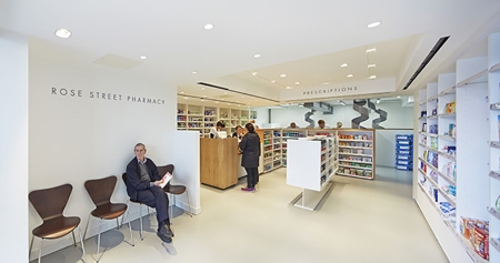
Barbara Weiss Architects won the refurbishment award for Wokingham Medical Centre
Award for Best Mental Health Development
The judges considered:
- RPP Architects and Richard Murphy for Old See House
- Duggan Morris Architects for The ORTUS
- Gilling Dod Architects for Junction 17, Tier 4 CAMHS Unit at Prestwich
- Northumberland Tyne and Wear for Roker and Mowbray Dementia Care Unit
- The Acute Division Greater Glasgow and Clyde and Macmon for the Acute Admissions Unit at Leverndale Hospital
- NHS Scotland for the Konar Suite refurbishment
Winners:
Gilling Dod Architects for Junction 17, Tier 4 CAMHS Unit at Prestwich
Junction 17 is the new £9m Tier 4 child and adolescent mental health unit in Prestwich. Delivered under P21+ with IHP as the principal supply chain partner, the state-of-the-art facility is a young person-focused inpatient unit for vulnerable patients from across the North West.
The design process was heavily geared towards meaningful end user engagement with the young people involved from the outset.
The modern, uplifting and non-institutional design provides 24 inpatient beds and includes an intensive care suite, therapy and activity spaces, and a fully-equipped integral college and learning zone.
Opened in December it improves the patient environment through the use of interior design and colour schemes, activity-led spaces, accessible gardens, light and airy clinical and relaxation spaces and hidden security fencing.
One parent said: “I was very nervous about my daughter coming into a mental health unit. I imagined it to be horrible Victorian asylum building. I am happy to say the modern bright place is lovely and welcoming. The building is exceptional.”
Jane Arands, lead manager of the trust, added: “This new environment has had the effect of improving the quality of care we are able to give through access to more areas and reducing environmental risks through better lines of sight. The light and space available promotes a calming, therapeutic atmosphere. We are very blessed to have such a wonderful place to care for young people with significant mental health needs.”
The judges agreed. They said of the project: “This space is cleverly broken up to provide a wonderful environment for patients and staff.”
Duggan Morris Architects for The ORTUS
The ORTUS is a 1,550sq m building housing learning facilities, a cafe, an exhibition area and ancillary spaces.
The central focus of this unique project was to create a totally-new concept to support all aspects of mental healthcare and one that pushed the boundaries of the online/digital world to seek and engage a global audience.
Commissioned by Maudsley Charity, the project was informed through an 18-month immersion process involving research and consultation with user groups, Kings College Hospital, the Institute of Psychiatry and local community groups, with Duggan Morris Architects brought in to develop the final brief, which was captured through a series of vision statements.
In response to local influences, the building has been designed as a free-standing pavilion. Flexible, sub-dividable spaces are positioned around a central void, navigated by a grand open staircase. One floor has been deliberately left open to allow for chance meetings, community engagement and to provide informal user and staff spaces. The overall layout was devised to futureproof the design to accommodate the changing needs of the charity.
The façade is articulated through a regular pattern of brick panelling and full-height windows, framed by an external expression of the concrete frame, with vertical and horizontal fins of pre-cast concrete. Internally, the use of brick creates a space that at once seems domestic and small, promoting a feeling of warmth.
A key vision for the new building was to destigmatise preconceptions of mental health and wellbeing by making it more accessible to the wider community.
The judges said of the project: “This is a conference and education centre for all, including service users. It is about seamless integration and in mental health this is seen as a very positive attribute.
“It is a well-considered building and a fine example of serious and rigorous architectural thought and creativity being brought to bear on the healthcare sector.
“This project raises standards for patients. It is a very original way of dealing with mental health issues and one that sets a new trend in mental health.”
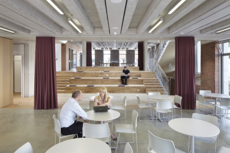
The ORTUS
Highly commended:
RPP Architects and Richard Murphy for Old See House
Old See House is a new community mental health facility that provides support for patients in the North Belfast area.
A pathfinder for the modernisation of mental health care in Belfast, the facility promotes the model of decentralised community-based services as set out in the recent Transforming Your Care policy document.
Setting a precedent for the future of community mental health design, the facility houses the community mental health team and consultant outpatient clinics. There is also a day treatment facility complete with a kitchen, craft room, one-to-one ‘talking pods’, and a therapy garden; and an eight-bedroom home treatment house designed for short-stay patients.
This part of the building has a separate entrance and private garden, self-service kitchen and open-plan living area designed to feel and operate like a stand-alone ‘home-from-home’ as opposed to a traditional mental health inpatient facility.
A spokesman for Belfast Health and Social Care Trust, which commissioned the building, said: “While giving the service user a sense of privacy, the building was designed to be an open, naturally-lit and inviting space that helps to promote a sense of calm and wellbeing.
“The design team and contractors have undoubtedly delivered on this brief with bespoke private areas and an entrance and main concourse that opens out to a beautifully-landscaped main garden protected from public view by the building itself. Early indications from service users are that the building is a therapeutic space that offers a relaxing environment during what is often a stressful experience.”
The judges said: “This is an immediately attractive place, with well-proportioned spaces and rich materials.”
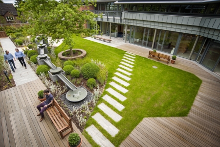
RPP Architects and Richard Murphy were commended for Old See House
Award for Best End-of-life Care Development
The judges considered:
- IBI Group for Kirkwood Hospice, Huddersfield
- Graham Construction, Jane Darbyshire & David Kendall Architects for St Columba’s Hospice
- P+HS Architects for St Benedict’s Hospice
- Gilling Dod Architects and Trinity Hospice and Palliative Care Services for Trinity Hospice
- RH Partnership for St Wilfrid's Hospice
- Poole Hospital NHS Trust for Forest Holme Hospice
Winner:
IBI Group for Kirkwood Hospice, Huddersfield
Comprehensive consultation and carefully-considered design has resulted in a palliative care hospice that has a definite sense of place within the community, providing a tranquil and therapeutic patient environment.
Widely admired, Kirkwood Hospice is a specialist facility in Huddersfield, West Yorkshire, providing adult palliative care.
First opened in 1987, its inpatient unit required significant upgrading to meet contemporary clinical, spatial and technical standards.
A new extension was proposed, complemented by substantial remodelling of the existing building to create two nursing units comprising nine single-bed rooms and two multi-bed bays. The existing gardens around the east and south of the hospice have also been extensively redeveloped, with a bespoke planting design providing spectacular all-year-round colour, an enlarged ornamental pond, new labyrinthine maze, and greatly-improved wheelchair access.
The patient bedrooms and lounges are orientated towards the landscaping; an arrangement which has, with the benefit of full-height glazing, filled the rooms with garden views and an abundance of natural light.
The spacious bedrooms are fitted with bespoke bedhead wall units incorporating all the clinical services, a medicine cabinet, a hoist, a wardrobe, and, in the single-bed rooms, a drop-down overnight bed for relatives.
Locating and concealing these fittings within the wall unit has freed up the other walls, facilitating full-height glazing to the window wall, and reducing visual ‘clutter’.
The multi-bed bays are configured in a ‘cruciform’ arrangement, an innovative design that is spatially efficient, provides good all-round visibility, and has a non-institutional feel. Each bay incorporates a seating area, enlarged en-suite sanitary facilities, a clinical write-up area, and increased clinical space around each bed.
Sustainable design features include good natural ventilation, solar shading to the large windows, and photovoltaic solar panels discretely incorporated into the south-facing roof tiles.
The judges said: “This project is absolutely lovely. It is an attractive, relaxed building with a positive relationship to its very pleasant site. The attention to each level of detail is commendable and the creative use of outdoor space, allowing beds to be taken out to sheltered, semi-private areas, is seen as a particular benefit.”
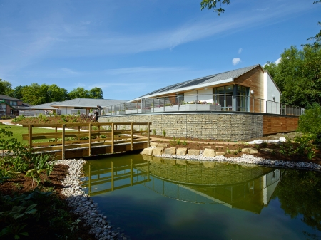
Kirkwood Hospice, Huddersfield
Highly commended:
Graham Construction, Jane Darbyshire & David Kendall Architects for St Columba’s Hospice
Space, good daylight, fresh air, quality materials and comfort, along with clarity of layout, distinguish St Columba’s Hospice from standard end-of-life care developments.
Centred around two Grade B listed buildings in a Conservation Area overlooking the Firth of Forth, the previously-outdated campus has been transformed into an exceptional 30-bed care facility that is a fine example of progressive vision in the UK hospice sector.
A collaborative approach ensured that patients, relatives and staff contributed at all times through the use of 3D models, fly-through videos and ‘meet the team’ events.
In response to conservation priorities, and in line with the client’s wishes to enhance the unique sense of place and retain the strong emotional and spiritual links to the existing location, the setting was improved through the demolition of outdated 1970s buildings.
The use of natural materials, both internally and externally, combined with integrated landscaped areas, creates a therapeutic, diverse and holistic environment for care.
Patient safety was addressed holistically through high levels of accessibility and ‘supportive design’, fulfilling the requirements of infection control while avoiding a visually-sterile environment. Patients feel liberated through the inclusion of garden or sea views from rooms and circulation areas, garden or balcony access from each bedroom, and a simple user-friendly layout.
Consideration of futureproofing the building was integrated into the general layout through its format of wings rather than a central block, and its access arrangements. Single en-suite bedrooms provide greater flexibility and larger rooms cater for highly-complex or bariatric patients.
Sustainable features include the use of natural ventilation and lighting, solar shading, the retention of existing trees and the addition of green roofs, rainwater harvesting and plans for the installation of biomass heating.
Margaret Dunbar, chief executive of the hospice, described the development as setting ‘a national benchmark in terms of hospice care environments’.
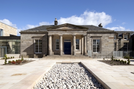
Graham Construction and Jane Darbyshire and David Kendall Architects were highly commended for St Columba’s Hospice
P+HS Architects for St Benedict’s Hospice
St Benedict’s Hospice is both a haven and a place of positivity for patients with life-limiting conditions and those involved in their care.
Themes of care, safety and nurture resonate throughout the design, from the curving plan to the use of natural materials, domestic interior finishes, and the array of accessible outside spaces, creating the highest-quality, non-clinical environment.
A collaborative and multi-organisational approach allowed rapid progress in replacing the outdated hospice, with the project moving from conceptual design to detailed planning in four months with a build programme of just 12 months.
Nestled securely at the heart of a generous landscaped site, the building provides outstanding views and access to a wide range of external spaces. The curved building plan represents an embrace, reflecting the support and strength provided to patients and families. A protective timber ‘cloister’ is used to link inpatient bedrooms and the front of the building.
The naturally-sloping site provided opportunity for a split-level design, locating the quieter inpatient accommodation at lower ground floor level, affording privacy and peace away from the more-active day spaces above. Here 14 spacious bedrooms have individual access to quiet, therapeutic outdoor space and beds can be manoeuvred outside via wide doors. Sheltered canopies provide privacy.
In addition to the exceptional inpatient and family accommodation, the fully-accessible building includes a café and shop, education and seminar facilities, lymphoedema unit, daycare facility, social spaces, therapy suites, and a variety of staff facilities and break-out spaces. Rooms are all designed for flexible use.
“The new facility offers so much potential to improve access, be creative, and deliver fantastic services for our patients,” said Katherine Henderson, clinical business manager for specialist palliative care and cancer nursing services at South Tyneside NHS Foundation Trust.
“Access to outside space is great and gives equal opportunity for all, regardless of ability. It meets spiritual needs in a way that we haven’t been able to do before, just in the ambience and the facilities alone.”
A patient’s relative added: “It’s like a 5-star hotel. It’s lovely to have a private room. It really is beautiful.”
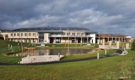
St Benedicts Hospice
Award for Best Supported Living Development
The judges considered:
- Keiro, P+HS Architects for The Gateway
- Surrey and Borders Partnership NHS Foundation Trust and Medical Architecture for the Oakwood adult autism unit
Winner:
Keiro and P+HS Architects for The Gateway
Providing supported transitional living throughout all stages of recovery and rehabilitation, the innovative Gateway project provides a new model of healthcare for people with acquired brain or spinal injuries and complex neurological conditions.
The model is designed to complement the NHS, facilitating quicker discharge from hospital, offering bespoke rehabilitation, and easing clients back into the community.
Set in Middlehaven, Middlesbrough, at the heart of a community in the throes of regeneration, the striking new building creates a landmark within the emerging contemporary architectural language of the area.
The brief was clear: Do not make it look like a hospital, and the designers rose to the challenge. Although there are highly-specialised clinical facilities and inpatient accommodation, all meeting the required healthcare priorities, the feel is more boutique spa hotel than medical centre. Interiors are light and bright with a varied colour palette.
Neuro rehabilitation and community hub services are accommodated in one six-storey building. Inpatient bedrooms for high dependency clients, some with very limited mobility, are arranged in groups of 10 over the uppermost floors, affording privacy and far-reaching views over the surrounding landscape. Rooms are spacious, making provision for mobility aids and other equipment, but supportive devices such as hoists are discretely mounted so that rooms do not feel like medical facilities.
Transitional housing is also located on site, with 12 fully-accessible units developed by housing partner, Erimus. A mix of two and three-bedroom units allows carers or families to live with clients while full support and specialist services continue to be available.
Viv Watson, managing director of Keiro, said: “The Gateway is a nationally-significant project that sets a new standard for care and community benefit. This project is a pioneering bridge between the public and private sectors.”
The BBH Awards judges added: “This is a really good idea. It brings multiple services together, giving a total pathway approach. We particularly like the multi-tasking and co-location of services.”
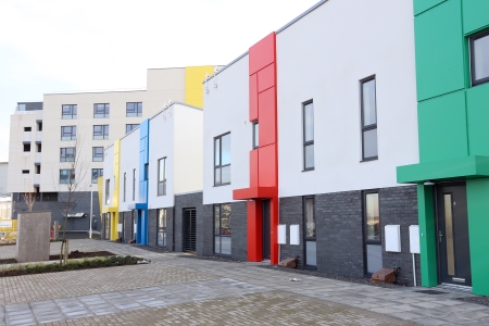
The Gateway
Highly commended:
Surrey and Borders Partnership NHS Foundation Trust and Medical Architecture for the Oakwood adult autism unit
Oakwood is a £2.5m project located in the heart of Caterham-on-the Hill in Surrey.
An ambitious project meticulously designed and constructed around the needs and preferences of residents and their carers, the self-contained seven-bedroom unit became operational in March. It provides residential accommodation for adults with autism and associated learning disabilities.
The home showcases a new evidence-based approach to design, with residents, their carers and staff involved from the initial concept stage.
This discussion with stakeholders has led to a number of innovative features, including an outdoor ‘room’ in the form of a central courtyard that provides a safe area for relaxation and reflection. Another example is the scale of the development being not too big, but offering long views to the tree canopies outside.
The design also helps to eliminate sensory stimulation, provide clear functionality, enhance safety, and provide personal and communal spaces. Enhanced ventilation and well-regulated environmental temperature control, improved lighting, and the inclusion of a sensory suite all work together to make the building stand out.
The BBH Awards judges said: “This project has been embedded in its local community in a social as well as a physical sense. This has been achieved through an extensive consultation process involving residents, carers, neighbours, local businesses, housebuilders and public services. The resulting scheme is humane and supportive.”
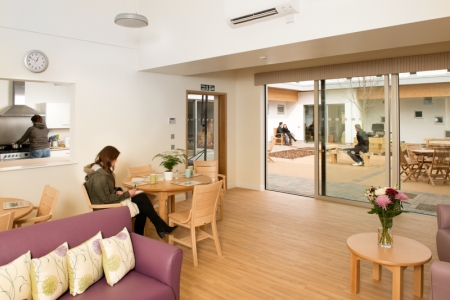
The Oakwood adult autism unit was highly commended
Grand Prix Design Award
The judges considered:
- Penoyre and Prasad for the Sir Ludwig Guttmann Health & Wellbeing Centre
- Duggan Morris Architects for The ORTUS
- Day Architectural for new theatres extension at Salford Royal Hospital
- Spire Bristol Hospital radiotherapy specialist care centre
- NBBJ and Bettisworth North for the Chief Andrew Isaac Health Center, Alaska
Winners:
NBBJ for the Chief Andrew Isaac Health Center, Alaska
The Chief Andrew Isaac Health Center serves Alaskan native people from 42 villages situated within a 235,000sq m region along the Tanana and Yukon rivers.
To fully understand the needs of patients, NBBJ's design team travelled to Koyukuk, a remote native village on the Yukon River. There they met with village chiefs and community representatives, visited schools and toured the community.
The resulting clinic is larger than any space in many of the patients’ small villages, so all entry points are low and non-intimidating to make them feel welcome. The building’s flowing form — with clinics adjacent to the river and an exterior landscaped river bed — also provide a culturally-familiar aesthetic.
To accommodate the close-knit, community-oriented culture, the main lobby and waiting area serves as a gathering area that encourages social interaction. Its circular shape, designed to resemble a woven basket, emphasises the native way of life and connects people in spirit.
At the centre of the gathering area lies a round made of stone and metal inlay that signifies the circle of life and cyclical nature of the seasons. It includes compass directions and seasonal elements of a subsistence lifestyle: trapping, berry picking, moose hunting, fishing and whaling. Smaller waiting rooms, all with southern exposure and views, allow for more intimate gatherings.
As native life follows the seasons, clinic walls bear subtle seasonal shades of green, yellow, orange and blue that indicate different areas for wayfinding.
The facility is also one of only a few buildings in Alaska to attain LEED Gold certification. It consumes 30% less water than average and reduces energy use by nearly 30%. The siting of the building saved more than 50 mature birch and aspen trees, and native plants add to its appeal. Water from rain and snowmelt feeds the landscape, eliminating the need for irrigation.
The judging panel said: “Architects have worked with, and clearly understood, the members of the Alaskan community which this building serves. The unusual form is a response to this investigation and provides a sympathetic, humane facility.”
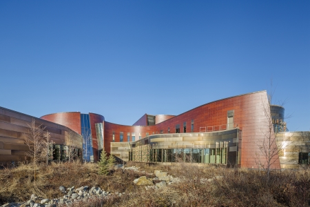
The Chief Andrew Isaac Health Center, Alaska, won the Grand Prix Design Award
Duggan Morris Architects for The ORTUS
The ORTUS is a 1,550sq m building housing learning facilities, a cafe, an exhibition area and ancillary spaces.
The central focus of this unique project was to create a totally-new concept to support all aspects of mental healthcare and one that pushed the boundaries of the online/digital world to seek and engage a global audience.
Commissioned by Maudsley Charity, the project was informed through an 18-month immersion process involving research and consultation with user groups, Kings College Hospital, the Institute of Psychiatry and local community groups, with Duggan Morris Architects brought in to develop the final brief, which was captured through a series of vision statements.
In response to local influences, the building has been designed as a free-standing pavilion. Flexible, sub-dividable spaces are positioned around a central void, navigated by a grand open staircase. One floor has been deliberately left open to allow for chance meetings, community engagement and to provide informal user and staff spaces. The overall layout was devised to futureproof the design to accommodate the changing needs of the charity.
The façade is articulated through a regular pattern of brick panelling and full-height windows, framed by an external expression of the concrete frame, with vertical and horizontal fins of pre-cast concrete. Internally, the use of brick creates a space that at once seems domestic and small, promoting a feeling of warmth.
A key vision for the new building was to destigmatise preconceptions of mental health and wellbeing by making it more accessible to the wider community. The judges said of the project: “This is a conference and education centre for all, including service users. It is about seamless integration and in mental health this is seen as a very positive attribute.
“It is a well-considered building and a fine example of serious and rigorous architectural thought and creativity being brought to bear on the healthcare sector.
“This project raises standards for patients. It is a very original way of dealing with mental health issues and one that sets a new trend in mental health.”
Award for Best Design Concept
The judges considered:
- BDP for Alder Hey Children’s Hospital
- Scott Tallon Walker Architects for the UCLH Proton Therapy Centre and Cancer Inpatient Hospital
- Archial Norr for North Ayrshire Community Hospital
- Interserve for The Walton Centre
- NBBJ and HKS for the Royal Liverpool University Hospital
- Balfour Beatty for the P21+ repeatable rooms cost reduction programme
Winner:
Archial Norr for North Ayrshire Community Hospital
North Ayrshire Community Hospital is a design for a new-build mental health and elderly care facility within the grounds of Ayrshire Central Hospital.
It contains 206 bedrooms within 11 inpatient wards, three support clusters incorporating centralised patient social and rehabilitation spaces, and outpatient consulting areas, ECT, IPCU, tribunal and pharmacy facilities.
The site sits adjacent to an existing listed building in a horseshoe arrangement with a central entrance and courtyard.
The scheme is driven by a clear and simple design concept with a new plaza setting up a relationship between the existing buildings and creating an orientation point from which the retained estate can be safely and clearly accessed.
Adult acute wards and older people’s wards are split into two wings, known as the South and North galleries. These flank a large therapeutic landscaping scheme within which are support clusters associated with clinical groups. These two galleries come together in the entrance café space which offers protection to the landscape from the prevailing south-westerly winds.
Running adjacent to the therapy garden the two galleries act as cloisters, linking the ward areas and the support clusters and forming a series of threshold spaces.
Meanwhile large, open-plan social spaces are located centrally with wings of bedroom accommodation beyond. The social spaces open into generous ward gardens, each specifically designed to suit the various patient groups be it dementia care, young people or intensive psychiatric care.
The bedroom wings are deliberately compact for ease of visibility and staffing efficiency. The stacking and joining of wards allows simple expansion and contraction of bedroom numbers between wards without modification or extension.
The BBH Awards judges said: “A complex brief was resolved into a simple, readable diagram which was then implemented in a manner giving rise to an attractive building.
“The relationship of the various elements to appropriate external space is particularly commended, along with the gentle change in expression of the architecture in moving from public areas to residential accommodation.”
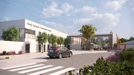
Archial Norr won the Best Design Concept Award for North Ayrshire Community Hospital
Highly commended:
BDP for Alder Hey Children’s Hospital
Described by the BBH judges as ‘ambitious and aspirational’ and praised for ‘challenging NHS norms’, the design for the new Alder Hey Children’s Hospital sets a new precedent for the delivery of paediatric care.
Through intensive interaction with staff, parents and patients over a three-year period, BDP has developed what it believes is a unique concept for the new Alder Hey - one that gives the 274-bed specialist hospital a striking new identity and fulfills the trust’s ambition to recast the facility as a ‘Children’s Health Park’.
On approaching the new site its gentle undulating profile and green roofs will look like a new hill within Springfield Park, something to surprise and delight children and young people of all ages. This hill rises up from the park to a high point over the main entrance, creating an obvious and welcoming front door.
Entering the atrium concourse at the heart of the new Alder Hey, visitors will have an instant sense of the building’s geography and the reassuring buzz of the hospital’s street life, a space more akin to the foyer in a large civic building than a conventional hospital.
A ‘hospital without corridors’ was the inspiration behind the design, opening up movement around the building so it never feels claustrophobic. The atrium is the hospital’s high street, drawing together the different parts of the building - the three ‘fingers’ of accommodation that fan out into Springfield Park, the outpatient cluster, and the multi-storey car park.
The sequence of spaces both inside and outside will themselves be stimulating and engaging, reinforced by interactive art pieces and other installations. Together the architecture, interiors, art and landscape become a positive distraction for families, offering a range of internal and external settings to suit different age groups and frames of mind.
In the spirit of ‘a home away from home’ bedrooms have been designed to be a child’s ‘safe haven’ with views over the park, ensuite bathrooms and a couch that can become a bed for parents.
Bedrooms are clustered in ‘pods’ of eight, sharing an open-plan ‘hub’ that gives them a more intimate identity within the wider identity of the 32-bed ward.
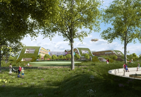
BDP was highly commended for Alder Hey Childrens Hospital
NBBJ and HKS for the Royal Liverpool University Hospital
When completed, the new Royal Liverpool University Hospital will revamp a once-impermeable site in the centre of the city that has suffered from poor integration.
NBBJ/HKS have designed a landmark urban gateway which, it is hoped, will energise the surrounding area and repair the urban fabric of Liverpool.
The design includes a publicly-accessible plaza at its centre. The simple and legible building layout, with clearly-defined entrances and circulation routes that promote intuitive wayfinding and orientation, is complemented by a clear masterplan that identifies accesses and routes to and across the site within an engaging site-wide landscape design scheme.
The design provides a healing non-institutional environment that enhances the patient, visitor and staff experience.
The building’s orientation and layout maximises natural light while minimising glare and solar gain. Stimulating views are provided from the building into the large internal gardens and out to the new central ‘Green Heart’ and neighbouring area. The design also features an innovative ‘cranked’ ward template, bringing natural light and extensive views to all the patient bedrooms,and also to corridors and staff areas.
The hospital design optimises departmental adjacencies and provides a circulation pattern that minimises travel time and distance. Patient, staff, visitor and goods/FM flows are segregated within the hospital and across the site as a whole.
Non-patient services are located in the clinical sciences and support building, separate from, but connected to, the hospital, minimising the impact on patients and visitors.
The BBH judges said: “This large urban hospital is a challenging building type and the extent to which this aspirational building is to be integrated into the city fabric is commended.”
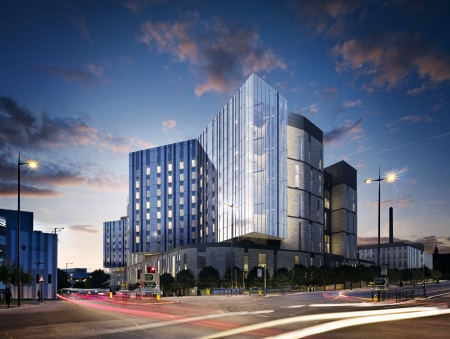
The design for the Royal Liverpool University Hospital was highly commended
Award for Best International Design
The judges considered:
- HOK for the Cedars-Sinai Medical Centre Advanced Health Sciences Pavilion
- Open Building Research for Children’s Hospital ‘Pietro Barilla’
- EGM Architecten for A15 Pharmacy, The Netherlands
- SynThesis Architects for the day centre for children with autism
- NBBJ for the Chief Andrew Isaac Health Center, Alaska
Winner:
NBBJ for the Chief Andrew Isaac Health Center, Alaska
The Chief Andrew Isaac Health Center serves Alaskan native people from 42 villages situated within a 235,000sq m region along the Tanana and Yukon rivers.
To fully understand the needs of patients, NBBJ's design team travelled to Koyukuk, a remote native village on the Yukon River. There they met with village chiefs and community representatives, visited schools and toured the community.
The resulting clinic is larger than any space in many of the patients’ small villages, so all entry points are low and non-intimidating to make them feel welcome. The building’s flowing form — with clinics adjacent to the river and an exterior landscaped river bed — also provide a culturally-familiar aesthetic.
To accommodate the close-knit, community-oriented culture, the main lobby and waiting area serves as a gathering area that encourages social interaction. Its circular shape, designed to resemble a woven basket, emphasises the native way of life and connects people in spirit.
At the centre of the gathering area lies a round made of stone and metal inlay that signifies the circle of life and cyclical nature of the seasons. It includes compass directions and seasonal elements of a subsistence lifestyle: trapping, berry picking, moose hunting, fishing and whaling. Smaller waiting rooms, all with southern exposure and views, allow for more intimate gatherings.
As native life follows the seasons, clinic walls bear subtle seasonal shades of green, yellow, orange and blue that indicate different areas for wayfinding.
The facility is also one of only a few buildings in Alaska to attain LEED Gold certification. It consumes 30% less water than average and reduces energy use by nearly 30%. The siting of the building saved more than 50 mature birch and aspen trees, and native plants add to its appeal. Water from rain and snowmelt feeds the landscape, eliminating the need for irrigation.
The judging panel said: “Architects have worked with, and clearly understood, the members of the Alaskan community which this building serves. The unusual form is a response to this investigation and provides a sympathetic, humane facility.”
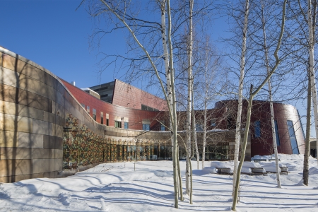
NBBJ won the Best International Design Award for the Chief Andrew Isaac Health Center, Alaska
Highly commended:
Open Building Research for Children’s Hospital ‘Pietro Barilla’
The design for the children’s hospital ‘Pietro Barilla’ in Parma was inspired by the criteria of humanisation and environmental psychology, reflecting the wishes of medical staff to create a place ‘designed around the children’ which was to be as homely as possible for the young patients.
As a consequence, the design synthesises health and functional needs with perceptual and psychological topics.
The double-skin façade becomes the architectural device that allows the interaction between the children and their environment.
It was designed to create a visual relationship between the building and its surroundings and to enhance the patients’ perception of natural phenomena - the sun moving as the hours of the day pass, and the colour of the leaves changing with the seasons.
The external layer of the façade, made of coloured vertical fins and transparent single glazing, reflects the surrounding context while creating a buffer zone that allows natural ventilation, improving the indoor climate and reducing energy use.
The colours chosen for the façade recall the chromatic palette of the natural and urban context surrounding the building. According to the movement of the observer, the colours cross-fade dynamically, providing an ever-changing appearance to the façade.
Patient rooms are designed to recreate a familiar environment for the children and they allow for views to the surrounding gardens.
The internal spaces – in particular patients’ rooms and common areas – have been positioned in order to open up internal views to the landscape and allowing natural light to penetrate into the building, thus facilitating the orientation of patients and visitors within the hospital.
At ground floor, the lobby is designed to be extended into the gardens and fragments of landscape are inserted into the building at the upper levels, further enhancing the relationship between the architecture and the landscape.
The judges described the building as having ‘a highly-innovative façade design that allows the creation of sheltered outdoor spaces’.
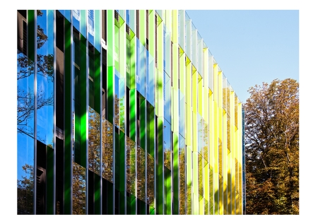
Open Building Research was highly commended for the Childrens Hospital, Pietro Barilla
EGM Architecten for A15 Pharmacy, The Netherlands
The internationally-respected Erasmus Medical Center in Rotterdam is using an integral approach in building its future.
The university’s medical centre, which offers academic medical care, education and scientific research, is becoming the largest 'drive-in hospital' in the world.
From the new external pharmacy, located along a national highway in the centre of The Netherlands, large quantities of medicines can be produced for both the Erasmus Medical Center and other hospitals in The Netherlands.
Wellbeing of the staff played an important role in the design of the 46,285sq ft building, with abundant incoming daylight a big influence. Large glass surfaces, wide corridors, and long sightlines have also been created to stimulate communication and interaction among staff.
The design of the building is based on a box-in-box principle, resulting in a corridor around the cleanrooms, which provides a clear view of the production process without having to enter the rooms. The box-in-box principle also made it possible to optimise the fire compartmentalisation and to achieve the required flow pressure cascade.
Additional space was created for a building services floor above the cleanroom. This consists of a walkable ceiling covering the entire cleanroom area for the distribution of all technical utilities with easy access to the grids and fittings of the rooms below. All building services are located directly above this distribution floor.
This design enables maintenance or repair work on technical components to be carried out from outside the manufacturing area, without disturbing the production process and therefore safeguarding the hygiene conditions in the cleanrooms.
Gerard de Jong, architect, said: “As an architect, you obviously want to end up with a beautiful building, but it is also my job to create an environment where people can do their work pleasantly and safely, and that contributes to their wellbeing.”
The BBH Awards judges added: “This is a highly-technical project. Extensive use of glass and skilful planning has delivered an elegant building and a fine place of work in a sector where adherence to good manufacturing practice (GMP) principles all too often drives design away from human issues.”
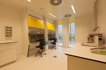
EGM Architecten was highly commended for the A15 Pharmacy in the Netherlands


