A new paper is offering advice on the use of colour when designing environments for people with dementia
A lack of research into the effect of colour on people suffering from dementia is hindering the design of more-therapeutic environments, according to a new study.
Margaret Calkins, an internationally-renowned leader in the field of environments for the elderly, has written a number of books and papers, including Design for Dementia: Planning Environments for the Elderly and the Confused, and her most-recent offering, How Colour Throws Light on Design in Dementia Care, which has been published in The Journal of Dementia Care
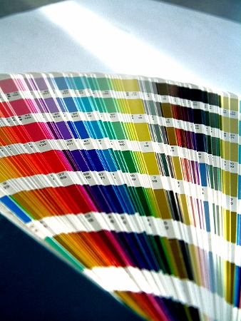
The amount of advice being given on colours for older people in general, and older individuals with dementia in particular, is rapidly growing
The latter aims to explode some of the myths around the use of colour that currently exist.
“The amount of advice being given on colours for older people in general, and older individuals with dementia in particular, is rapidly growing,” Calkins said.
“Unfortunately, most of this advice has virtually no basis in any empirical, or even systematically-gathered, evidence.
“There are some enticing possibilities about being able to create spaces that encourage more activity and participation, or places that are calmer and more restful, but the lack of research hinders designers from being able to apply colours with confidence.”
Speaking to the Ideas Institute about the paper, she sets out a number of points for designers to follow when planning colour schemes for people with dementia. These are based around the fact that there are two main components that impact how we perceive colour. The first is the pigments used on every surface we look at. The second is the lighting that is used to provide the illumination that enables our eyes to see these objects.
“It is important to consider both aspects when dealing with colour within the environment, said Calkins.
The impact of colour
What is known from existing research is that certain colours have a particular effect on how we feel. Blue, for example, has a calming effect and has been found to lower blood pressure; while red increases brain wave activity. Green is the most-restful of the colours, while yellow, being highly visible, makes rooms appear larger.
However, less is known about how different hues impact on a person’s perception of a space. As people age, there are a number of changes that occur that will affect both vision and colour perception, and this makes it an important consideration when designing therapeutic settings for people with dementia.
There are some enticing possibilities about being able to create spaces that encourage more activity and participation, but the lack of research hinders designers from being able to apply colours with confidence
Earlier research shows that, beyond changes in the ability to focus, with age colour perception or discrimination also diminishes.
Further studies have shown there is a marked decrease in the ability of people with dementia to name individual colours.
Colour preference among dementia sufferers is for blue, red and green, in that order.
Commenting on how this research can inform the choice of environment for people with dementia, Calkins said: “The data might suggest that all environments should be primarily blue, red or green. However, it's important to recognise that colour preference studies are typically done with small chips of coloured paper, which is very different than seeing the colour applied to one or more wall surfaces.
Overcoming limitations
“Complex issues, such as pattern or amount of coverage of colour versus background have not even been considered.”
Despite these limitations, there are still some basic colour principles that can be reasonably applied when creating settings for people with dementia.
Advice from her research includes:
- Pay close attention to elements that have the potential to provide useful information, including signage, and give these more emphasis with brighter colours, higher contrast with the background, and more light
- Avoid high contrasting, bold patterns on flooring, borders within rooms, and in hallways
- Provide high contrast at the edges of stairs or level changes so they are easy for people to see
- Chair seats should contrast with the floor
- Sink basins should contrast with the surrounding counter/vanity top
- Toilets and toilet seats should contrast with both the floor and surrounding walls
- Table settings should provide high contrast between the plates and the table or placemat
- Rooms that are too warm can be decorated in cool colors - blues and violets – so people perceive them as being cooler. On the flip side, decorating a cool room with warm colours will make it appear to be warmer than it actually is
- If space is at a premium, using cooler colours will make rooms appear to be slightly larger
- If you want to space to be active, use warm colours, particularly red, which is physiologically stimulating
There is a need for more-systematic research on the behavioural and emotional impact of colours on people with dementia, particularly studies that look at colour as it is applied in the environment, not just on small swatches of paper
Calkins concludes: “There is a need for more-systematic research on the behavioural and emotional impact of colours on people with dementia, particularly studies that look at colour as it is applied in the environment, not just on small swatches of paper.
“Judicious use of contrast should be given careful consideration when creating spaces for people with dementia.”
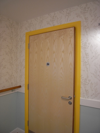
Colours can be used to make rooms stand out, such as this toilet


