The winners of the Patient Experience Class of the 2013 Building Better Healthcare Awards are
Award for Best External Environment
This award recognises an outstanding external space that enhances the overall experience of patients, staff and visitors through gardens, landscape, urbanscape or streetscape
Winner: Wasteland becomes a teenage retreat (Pennine Care NHS Foundation Trust)
Imagine a playful, educational and sustainable place where young people with acute and intermediate mental health issues could spend time with each other, with family members and with the wider community in an outdoor environment.
Imagine a space that patients have designed themselves and which was born from wasteland to encourage the local ecology; a place they would look after and respect, a place where the number of aggressive incidents could be dramatically reduced, and a place even the planners could be bowled over by!
The Woodland Retreat at Fairfield Hospital in Bury has turned this dream into a reality; creating a first-of-a-kind development that young people can call their own.
Involving service users and staff in the design process from the outset, the project is innovative through its adoption of a treehouse concept to blend into the surrounding environment and otherwise disused woodland area, expanding this idea to enable activities such as gardening and the cultivation of vegetables. This encourages independence, meaningful social interaction and a heightened awareness of responsibility and care, all important to enhancing the patient experience.
The success of the Woodland Retreat is substantiated by a reduction in the length of admission by 10 days, an 8.5% reduction in self-harming incidents, and a 65% reduction in the incidents of violence and aggression.
This is an inspirational project that has transformed an area of wasted space outside a children and adolescent mental health secure unit into a space for education, reflection and therapeutic engagement
The building itself is made from sustainably-sourced wood supplied by local timber merchants, and felled saplings from the woodland were reused to construct perimeter fencing. It is heated and cooled using an air source pump, lit by LED lights, insulated and enhanced with a sedum roof, and serviced by a self-composting toilet. There is also a birdbox web cam and a pond to attract local wildlife.
“Parents are very pleased when they visit,” said one member of staff. “It instils a sense of reassurance that their child is being cared for in a service that values young people and cares for their needs in an age-appropriate way.” Choosing it as their winner, the judges said: “This is an inspirational project that has transformed an area of wasted space outside a children and adolescent mental health secure unit into a space for education, reflection and therapeutic engagement.
“We were particularly impressed with the imagination shown by the trust in recognising how a very challenging, sloping site could be redesigned to provide such a stunning, interesting and engaging space for the young people.”
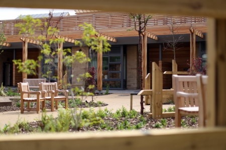
St Benedict’s Hospice and Specialist Centre for Palliative Care (P+HS Architects, Southern Green, St Benedict’s Hospice) was highly commended in the External Environment category
Highly commended: St Benedict’s Hospice and Specialist Centre for Palliative Care (P+HS Architects, Southern Green, St Benedict’s Hospice)
Nestled within a spacious site, this new hospice and specialist palliative care centre benefits from extensive access to a variety of outstanding external spaces tailored to the varying needs of users. These include a lakeside walkway with timber bridge, inpatient courtyard garden, staff courtyard garden, children’s play area and daycare garden.
Planting of the sheltered courtyard spaces is designed to create lush, exciting environments, with high levels of seasonal variation and interest. Mature specimen trees and canopies are provided throughout to provide dappled shade.
Designed in conjunction with landscape architects, Southern Green, the scheme had sustainability at the forefront, boasting green roofing, diverse planting, a natural lake and stored rainwater irrigation systems.
The judges said: “Early consultation with patients emphasised the importance of the integration of the internal and external spaces and the design has recognised the restorative value of gardens and natural landscape.
“Care has been taken to design specific spaces for the different activities undertaken in the building, with quiet private courtyards for inpatients and areas for horticultural activity for day patients. Longer walks take in the natural landscape and lake from where distant views of the sea can be enjoyed.”
Award for Best Internal Environment
This award recognises an outstanding therapeutic space that enhances the overall experience of patients, staff and visitors through an effective approach to interior design
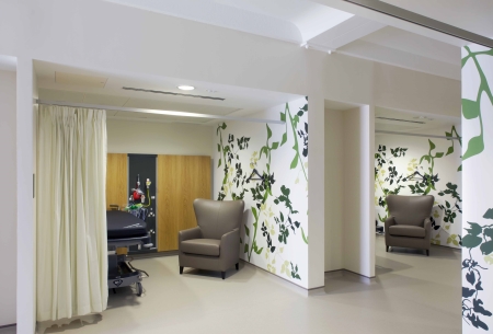
CircleReading (Circle Health, Bryden Wood)won the title of Best Internal Environment
Winner: CircleReading (Circle Health, Bryden Wood)
Circle Health’s aim was to deliver a first-class patient experience closer to that of a hotel than a hospital. As well as providing first-class food, hospitality and nursing care, they wanted to redefine the expectation of what a hospital interior should look and feel like.
The main feature of CircleReading’s internal environment is the central, double-height atrium. It acts like the main street of the hospital, creating a hub around which consultation and treatment rooms, patient recovery, imaging department, administration areas and restaurant are located.
A grand staircase and lift rises from this atrium to the upper levels with views afforded back into this central space wherever possible to help orientate visitors.
Punctuated by strategically-placed nurse and admin stations, the naturally-lit circulation and waiting spaces throughout the hospital are generously scaled.
Clinical areas have been carefully planned to ensure the privacy and dignity of patients. The operating theatres, first-stage recovery area, daycase recovery and routes to the inpatient bedrooms are laid out directly adjacent to each other and benefit from natural daylight. Crossovers with more public areas of the building have been eliminated and the daycase recovery area has been planned in two distinct areas to provide for male and female separation.
The look and feel of the public areas is defined by the warm colour palette and non-institutional finishes. Real oak flooring has been used where infection control considerations allow; wall protection has been kept to the bare minimum; and a constantly-changing art programme has been established.
This bold and modern design has used a non-institutional colour palate and furnishings to create an uncluttered, welcoming and professional healthcare environment
The bedrooms and en-suite shower rooms are designed to feel as much like hotel rooms as possible, while balancing clinical and infection control demands. Bedside medical panels are recessed into smoked oak wall panelling while the wardrobe, desk and soft seating area have been combined to make one large luxurious feature that wraps around the window. The integrated sofa can also be transformed into a bed for use by visiting family staying overnight.
Day case patients each have an allocated recovery bay in which to spend the day with solid walls with smoked oak panelling, ensuring peace and privacy.
The judges said: “This bold and modern design has used a non-institutional colour palate and furnishings to create an uncluttered, welcoming and professional healthcare environment.
“Natural light abounds, even in the operating theatres and recovery rooms, and patient rooms have been designed to be comfortable and more hotel-like, rather than traditional clinical rooms.
“Overall this is a modern hospital designed with thought and care that exemplifies good design.”
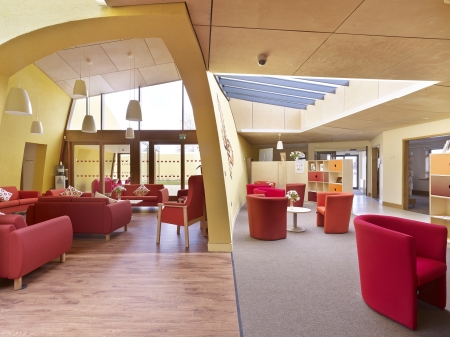
The Louise Hamilton Centre (LSI Architects, Palliative Care East) was highly commended in the Best Internal Environment class
Highly commended: Louise Hamilton Centre (LSI Architects, Palliative Care East)
Set in the grounds of the James Paget University Hospital, the Louise Hamilton Centre provides a much-needed care base for patients and their families in the Great Yarmouth and Waveney area.
Operated by local charity, Palliative Care East, the building design is based around the idea of providing a high-quality inspiring space that will bring hope to patients and visitors.
Interior design features include curved walls connecting the inside and outside of the building; a butterfly wall within the entrance, with butterflies sold to raise money for the project and named in memory of patients and supporters; splayed windows that boost the amount of natural light in counselling spaces; and well-thought-out signage to aid wayfinding.
Careful use of rooflights allow natural daylight to flood the inner areas, while the interior design is as much in the shapes of spaces and the views between as it is in the colour on the walls. Visual contrast is provided without being obviously contrived, and manifestation is based on the centre's butterfly logo.
The judges said: “The importance of the environment to the healing process has been recognised within the design and connections have been made between the exterior and interior of the building through the continuation of the dramatic brightly-coloured curved walls. The lounge area provides a welcoming central hub and there are a range of accessible smaller areas for people to have quiet conversations.
“Furniture has been chosen to be comfortable and used creatively to part screen areas in order to enhance privacy.”
Award for Best Collaborative Arts Project
This award recognises a collaborative arts project that has had a measurable positive impact on the patient and staff experience within a healthcare environment
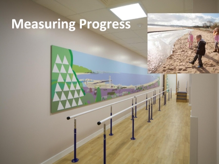
The Award for Best Collaborative Arts Project went to the Rehabilitation encouraged by art initiative (Abertawe Bro Morgannwg University Health Board)
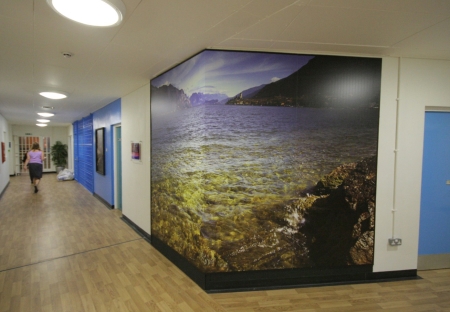
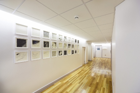
Winner: Rehabilitation encouraged by art (Abertawe Bro Morgannwg University Health Board) Work has recently been completed on a three-storey specialist rehabilitation centre at Morriston Hospital in Swansea. The centre provides accommodation for three main clinical services, the artificial limb and appliance centre, the rehabilitation engineering unit, and the podiatry and orthotics services. Patients felt very strongly that the artwork within the building should reflect the work of the centre, be a useful tool in their recovery and, given the seriousness and potentially life-limiting conditions of the patients, demonstrate what could still be achieved, whether that be through everyday activities or life-improving functions. It was clear from these discussions that patients had found the experience and advice of others helpful in getting through their own recovery and that a single phrase or photograph would not be enough to cover everything they wanted to say. This provided the inspiration for a library of videos recording a whole range of people of different ages and histories to be used in counselling as a reference to encourage and facilitate the recovery and rehabilitation of others. The proposal was to focus on illustrating, through photography and film, the treatment stages and recovery and to celebrate both the everyday and extraordinary achievements that have been made by some of the long-standing patients, illustrating that life needn’t necessarily come to an end or deteriorate, but may still be fulfilling. The idea of giving people with sometimes terrible injuries some real inspiration through photographs is really quite nice Careful consideration was given to positioning the completed artwork around the building. Photographs of patients undergoing the fitting of a prosthetic leg are sited within the fitting area, for example, so that new patients have a visual concept of the treatment they will be receiving. The gait analysis room this is complemented by a mural of Swansea Bay, which allows progress in walking to be monitored by means of white movable ‘sails’ that can be annotated with the patient’s name and used to identify the progress achieved over the pathway. Frazer Pratt, a service user, said: “It’s not about how other people define you in any picture, it's how you define yourself because when you lose a limb or two it becomes the first thing you think about in the morning and the last you think of at night. “The message I am trying to give in my photo and quote is to try and rise above the disability you have and get on with life, then it becomes the second thing you and others think of when your name is mentioned.” The judges said: “The idea of giving people with sometimes terrible injuries some real inspiration through photographs is really quite nice. There are a lot of photos of people doing things to encourage patients themselves to do those things. “We particularly like the image of Swansea Bay where patients can feel their progress as they walk round a landmark that is familiar to them. “Care has been taken to select and display photographs to fit with the different stages of the treatment pathway and the images are well chosen and joyful, showing a variety of activities being undertaken by people with disabilities to encourage others through their rehabilitation.” Manchester Prison (HMP Manchester, Lime Art) was highly commended for Best Collaborative Arts Project Highly commended: Manchester Prison (HMP Manchester, Lime Art) The main aim of this project was to totally transform the outpatient department of the HMP Manchester health unit into a therapeutic, calming, and welcoming environment through the use of integrated bespoke artworks as part of a wider refurbishment. Involving prisoners, healthcare staff and the wider prison community was fundamental to developing relevant ideas and artwork themes. The interior design elements including the colour scheme, new lighting, new flooring, new reception desk and seating were all co-ordinated to work in harmony with the bespoke artworks throughout the corridor spaces, two waiting rooms and treatment rooms. These include large-scale paintings created by prisoners around the theme of ‘Manchester at Night’; ‘Dusk Till Daybreak’ watercolours and digital displays; and three photomontage lightboxes. The judges said of the project, which was carried out at part of the King’s Fund’s Enhancing the Healing Environment programme: “Bold use of colour and a new lighting scheme throughout the refurbishment highlights the eclectic range of different artworks chosen, many reflecting local scenes or landscapes. “Lightboxes and installations have been used to bring extra light into the waiting areas and the use of simple black frames, made in the prison, for all the single or grouped artworks has cleverly brought the whole collection together. The artworks, many of gallery quality, have both recognised and celebrated the creative talents of the prisoners.” The Royal Brompton Centre for Sleep (Royal Brompton and Harefield NHS Foundation Trust, Steven Appleby) was highly commended in the Best Collaborative Arts project category Highly commended: Royal Brompton Centre for Sleep (Royal Brompton and Harefield NHS Foundation Trust, Steven Appleby) Steven Appleby’s installations at the Royal Brompton Centre for Sleep are based on research and conversations with patients, clinicians and researchers over one year. His work is also influenced by his own diagnosis during the year with sleep apnoea. It contains a wry recognition of the problems associated with sleep disorders, but through his references to dream-life, literature, and his wit and use of comedy, he looks beyond individual pathologies at everyone’s experience of sleep – its frustrations, strangeness and familiarity. Features include a 3.5m ceramic-printed glass screen and several wall drawings, enhancing the sense of space and emphasising clarity and light; while each bedroom holds twin collages in gilt frames – domestic in scale and full of colour and warmth. The judges said: “This shows real collaboration. It is a very worthwhile project. We particularly like the way that art has been used to help patients navigate through the building, replacing institutional lettering with handwriting and drawings, thus avoiding the extensive use of institutional signage.” 