The winners of the Building Design Class of the 2013 Building Better Healthcare Awards are
Award for Best Inpatient Facility
This award recognises an exemplary new-build or refurbishment project of any size that includes inpatient accommodation and has been designed to create a positive, supportive and therapeutic environment for patients, visitors/carers and staff
Winner: South West Acute Hospital, Enniskillen (Stantec, Western Health and Social Care Trust)
One of the first major 100% single room hospital developments in the UK, the £276m new South West Acute Hospital in Enniskillen was described by the judges as ‘well thought out’, with neat internal spaces and good landscaping.
Designed by Stantec, the 69,000sq m hospital has 300 beds, with designated centres for the treatment of women and children.
Designed to a simple plan, it creates a sense of order and natural legibility through the strategic positioning of buildings, entrances and circulation points.
This design provides a benchmark for future hospitals. It capitalises on the natural beauty of the surrounding environs, making it possible to be in contact with the environment from almost all areas of the hospital
The building mass is broken down into connecting groups of modest blocks organised around a central spine – the linear garden.
Balancing the need for high-tech medical equipment integration with the requirement for comfort, normalcy and dignity, the project promotes wellbeing through the inclusion of gathering spaces and havens, together with art, access to and views of nature, and the creation of age-appropriate spaces.
To enhance the patient environment there are hotel-like interiors, visible and accessible information points and clear wayfinding solutions built into the design. All patient rooms also have their own controls and there are plenty of social spaces.
Infection control is addressed through detailed departmental layouts and the segregation of flows for public, clinical and services.
Elaine Way, chief executive of Western Health and Social Care Trust, said: “This hospital is one of the most modern facilities in the whole of Europe. Not only is it technologically up-to-date, but it also has 100% single rooms so that our patients can enjoy privacy.”
A spokesman for Stantec added: “This design provides a benchmark for future hospitals. It capitalises on the natural beauty of the surrounding environs, making it possible to be in contact with the environment from almost all areas of the hospital.
“Natural materials, external views, natural colour and material palettes and integral furniture combine to soften the integration of important medical technologies to create an environment that feels familiar and comfortable.”
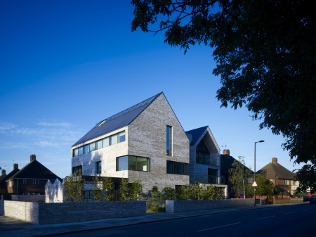
The North London Hospice (Allford Hall Monaghan Morris, The North London Hospice)was named Best Community Healthcare Design
Award for Best Community Healthcare Design
This award recognises an exemplary community-based new-build or refurbishment project of any size that embraces the aim of bringing health and wellbeing services closer to patients’ homes
Winner: North London Hospice (Allford Hall Monaghan Morris, The North London Hospice)
The North London Hospice is a charity that helps people with life-limiting illnesses by providing emotional, spiritual and clinical support to patients, their families, friends and carers.
Serving outpatients from Barnet, Haringey and Enfield for almost 20 years, the organisation has seen a significant increase in demand and needed a new base to cope with up to 300 people diagnosed with life-threatening illnesses every month.
The site chosen housed a disused NHS health clinic on a prominent corner opposite a large green space in a suburban area of Enfield, north London.
In recent years the building had fallen into disrepair, was derelict and subject to occupation by squatters. Completed in May 2012, the new facility provides a base for the delivery of services and encourages patients to drop-in for a chat, join in creative therapies, undergo treatment or simply to relieve their carers.
It is simple in that it is basically three materials - brick, white plaster and wood - but it is very impressive. This raises the bar and shows what can be done
With pitched roofs and a traditional brick construction, the building features a generous porte-cochere to receive patients, leading them through to a multi-purpose day room that opens out on to a south-facing courtyard designed in collaboration with BBUK Landscape, as well as an open plan kitchen and café. Smaller rooms for creative therapies, a hairdressing salon, sluice and a rest room support the key ground-floor spaces, while the first floor houses clinical, interview and teaching activities.
In an effort to reduce walking distances, a small car park has been designed with an additional entrance and exit off a quiet street to permit private ambulances and cars to reach the canopy and deliver patients directly to the main entrance with little effort.
Choosing it as their winner, the judges said: “For quite a substantial building it fits into the suburban area very well because of the shapes.
“It is simple in that it is basically three materials - brick, white plaster and wood - but it is very impressive. This raises the bar and shows what can be done.”
Award for Best Primary Care Design
This award recognises an exemplary new-build or refurbishment project of any size within the primary care sector that has been designed to create a positive, supportive and therapeutic environment for patients, visitors/carers and staff
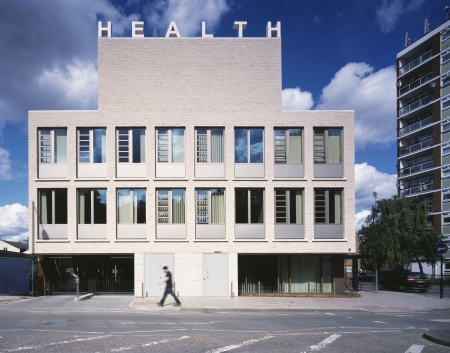
The Award for Best Primary Care Design went to Akerman Health Centre (Henley Halebrown Rorrison)
Winner: Akerman Health Centre (Henley Halebrown Rorrison)
Described by the judges as a ‘rational building which sits well on the site’, Akerman Health Centre expresses the architects’ goal of creating a truly public structure, not only in layout and elevation, but also in the relationship with its neighbours and in its detail.
The centre accommodates a range of services including GP clinics, dentistry, children’s services, midwifery, primary care and community health services. It also provides a base for Lambeth’s school nurses, health visitors and district nurses and the council’s adults and community services team.
On the ground, first and second floors, it is rectangular in plan, while the third floor describes an extended cruciform shape. This same motif is evident in all four elevations.
A hybrid, the building takes its cue from both the plan form and massing of a minster and the homogenous façade of an 18th-century London terrace.
At street level windows are set in a storey-high podium of perforated Corten, a frieze of ‘paintings’ by artist Daniel Sturgis whose perforations provide ventilation to an underground car park. Together the windows and artwork form a cradle for the ivory-coloured brickwork above. Similarly-coloured mortar and masonry copings homogenise to create a monolithic form offset by the roughly-shaped and heavily-textured brickwork.
This is a rational building which sits on the site very well and looks like it has always been there. We like the scale of it and the way the patient spaces have been skilfully designed
The main entrance is marked by a residual transept and crossing comprising of a steel and glass port-cochere, while the foyer itself is divided into four quadrants, one of which incorporates the main staircase. Overhead, four storeys above the foyer, a cruciform skylight illuminates a painted frieze by artist Paul Morrison.
Inside, the building is efficiently organised into three bands of cellular accommodation. The 16m-deep floorplate creates naturally-lit east and west-facing accommodation between which ancillary spaces such as toilets, stores, stairs and lifts are located. The central position of the foyer, stairs and lift permits efficient circulation to each clinical cluster.
The judges said: “This is a rational building which sits on the site very well and looks like it has always been there. We like the scale of it and the way the patient spaces have been skilfully designed.”
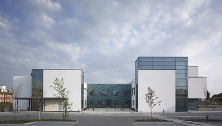
Finchley Memorial Hospital (Murphy Philipps Architecture) was highly commended in the Best Primary Care Design category
Highly commended: Finchley Memorial Hospital (Murphy Philipps Architecture)
One of the largest projects to be delivered through the national NHS LIFT framework, the new Finchley Memorial Hospital provides a contemporary, fit-for-purpose healthcare environment set within a landscaped health campus.
The development promotes general wellbeing through a range of outdoor spaces including therapy and memorial gardens, communal areas, a café and playing fields.
Patient bedrooms and social areas enjoy views over the surrounding green space, while public waiting areas look into large courtyards.
The judges said: “This is a well-considered building designed with both patients and sustainability in mind.”
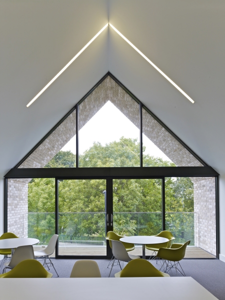
North London Hospice was also highly commended in the Best Primary Care Design category
Highly commended: North London Hospice (Allford Hall Monaghan Morris, The North London Hospice)
Built on the site of a rundown and disused NHS health clinic, the new North London Hospice supports people with life-limiting illnesses and their carers.
Completed in May 2012, it was designed to feel airy and convey a domestic sense of wellbeing, moving away from the institutional feel of many health and social care environments.
The use of brick, timber floors, slim window profiles and mute colours all contribute to an honest and gentle environment for patients and carers.
It was described by the judges as fitting in well with its surroundings and ‘raising the bar’ for future healthcare design.<.p>
Award for Best Conceptual Healthcare Building
This award recognises an idea, concept or actual design for a healthcare facility that explores new means of enhancing the patient experience
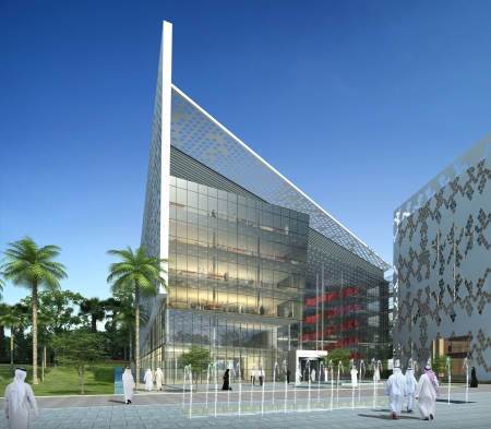
The Cresent Building, King Fahad Medical City (Devereux Architects) won the award for Best Conceptual Healthcare Building
Winner: The CRESENT Building, King Fahad Medical City (Devereux Architects)
A concept the judges described as a ‘genuine piece of innovation’ Devereux Architects’ CRESENT Building is conceived as the ultimate methodology for preventive medical care, reducing the risk of medical errors and enhancing infection control, security and privacy and dignity.
The 20,000sq m ‘virtual hospital’ will have the most-comprehensive clinical training facilities ever assembled under one roof.
By recreating every conceivable hospital scenario, medical outcomes and patient experiences will be radically improved. At the same time distressful and costly clinical errors will be dramatically reduced.
State-of-the-art simulation will enable practical training for all grades of staff, from cleaners to neurosurgeons on five floors, with all key hospital departments represented including A&E, pharmacy, life support facilities, operating theatres, catering, imaging suites and inpatient accommodation.
It is a very fine building and a concept that I think is moving the argument forward. It is a genuine piece of innovation
A landmark structure, the new hospital gateway will feature an angled skin façade that will appear to float off the face of the glass building behind. This will provide a backdrop for night-time creative graphic and colour displays.
A new piazza and an ‘urban oasis’ will incorporate fountains, soft landscaping, large trees and meandering water channels with formal and informal shaded zones for people to congregate.
The front glazed atrium with open walkways and breakout lounges will act as the circulation ‘hub’ and provide a stimulating environment for informal meetings and interaction across all floor levels.
L-shaped floorplates will bring plenty of natural light into the building and provide dramatic views out and, to boost energy efficiency, facades are protected from solar gains by a ‘veil’ screen which will dramatically reduce cooling loads. Each floor also incorporates a waste disposal room where waste will be separated into recycling bins and an extensive array of photovoltaic panels will shade the ventilation plant and provide renewable electricity to cool the building’s interior.
The judges said: “This is a beautifully-imaged entry. It is a very fine building and a concept that I think is moving the argument forward. It is a genuine piece of innovation.”
Award for Best International Healthcare Design
This award recognises an exemplary new-build or refurbishment healthcare building project of any size that is located outside of the UK and creates a positive, supportive and therapeutic environment for patients, visitors/carers and staff
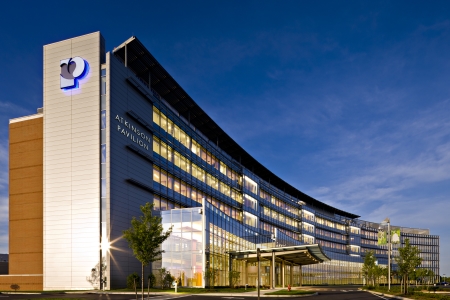
The Award for Best International Healthcare Design went to the University Medical Center of Princeton (HOK Architects, Princeton HealthCare System)
Winner: University Medical Center of Princeton (HOK Architects, Princeton HealthCare System)
The new University Medical Center of Princeton in Plainsboro, New Jersey, is a dynamic centre of medicine and technology, comfort and compassion, disease prevention and education.
The 638,000sq ft community hospital is part of the Princeton HealthCare System and replaces a 93-year-old facility which could not adequately accommodate the institution’s growth and evolution.
The new hospital reflects the most-advanced thinking about the way people interact, with 266 private patient rooms, state-of-the-art emergency services, operating suites, and a comprehensive array of ambulatory services and laboratories.
Major drivers that guided the design solution included:
- Creation of the most modern accommodation to treat high acuity patients
- Management of lower acuity patients in a day case setting
- An efficient, safe and friendly way of organising services
- Creation of a welcoming, intuitive and convenient place for the local community
The project was designed for 150% of projected need and areas both onsite and within the building were reserved to facilitate future expansion.
The new centre will be a model for the nation, transforming the way illness is prevented, health is maintained, care is delivered, and families are supported
The building features energy and resource conservation innovations including a sunlight-regulating exterior ‘veil’ that will significantly reduce the amount of energy required for heating and cooling; an onsite cogeneration plant; a ventilation system that delivers 100% fresh air in critical patient care areas; indigenous landscaping materials; and a rainwater collection system.
The site also provides extensive recycling, public transport access, supports bicycle use and provides power hook-ups for alternative fuel vehicles. These features have resulted in a 50% reduction in carbon footprint and a 20% cut in energy costs.
Barry S Rabner, Princeton HealthCare System’s president and chief executive, said of the development: “The new centre will be a model for the nation, transforming the way illness is prevented, health is maintained, care is delivered, and families are supported.”
Our judges called the project ‘inspirational’.
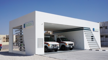
Hamad Medical Corporation Ambulance Service was highly commended for the Best Conceptual Healthcare Building Design Award
Highly commended: Hamad Medical Corporation Ambulance Service (Hamad Medical Corporation Ambulance Service)
‘Quite delightful’ and ‘a little gem’ was how the BBH Awards judges described this development. Operated by the Hamad Medical Corporation Ambulance Service (HMCAS), Spoke Station is a small structure that can be relocated as required. It is designed to provide covered parking for up to two ambulances and accommodation for a small crew room of up to four paramedics.
Providing shelter from the summer heat in a safe environment, the stations are versatile and designed to be completely self-contained, without requiring connection to existing electricity, water or sewerage infrastructure or to any physical links with service providers.
The judges said: “It is a nice solution when you think of the chaos outside ambulance stands in normal A&E departments around the world.”
Grand Prix Healthcare Building Design Award
This award was presented to the project the judges felt had made the biggest impact in terms of design and the effect it has on the people who use it. The winner was chosen from all the entries in all categories within the Building Project Class
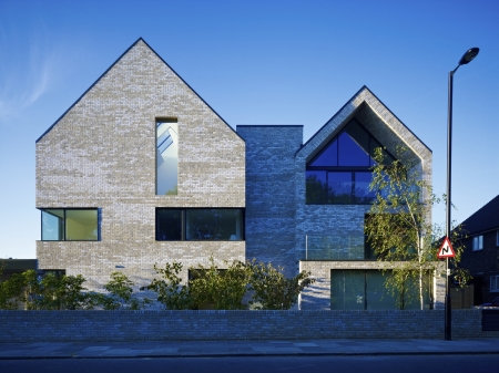
The North London Hospice was also the winner of the Grand Prix Healthcare Building Design Award
Winner: North London Hospice (Allford Hall Monaghan Morris, The North London Hospice)
In 2009 the North London Hospice charity approached Allford Hall Monaghan Morris architects will a view to increasing the provision of palliative care in the community of Enfield by building a new facility offering clinical and day care activities.
The new building, completed in May 2012, raises the profile of the charity by acting as a base for the delivery of new services and encouraging patients to drop in for a chat, join in creative therapies, undergo treatment, or simply to provide relief for carers.
The domestic context lends itself to pitched roofs and a traditional brick construction while a generous porte-cochere receives patients, leading them through to a multi-purpose day care room that opens out on to a south facing courtyard designed in collaboration with BBUK Landscape, open plan kitchen and café. Smaller rooms for creative therapies, a hairdressing salon, sluice and a rest room support the key ground-floor spaces, while the first floor houses clinical, interview and teaching activities. The pitched second floor offers generous administrative facilities, enabling staff to expand as their needs develop. In this manner the building is simplistically sectioned, allowing patients best use of level access and increased privacy as they ascend.
This project raises the bar and shows what can be done. It is an exceptional scheme
In an effort to reduce walking distances, a small car park has been included with an additional entrance and exit onto a quiet street to permit private ambulances and cars to reach the canopy and deliver patients directly to the main entrance with little effort.
It was important to client and architect that the building felt airy and instilled a domestic sense of wellbeing so as to avoid any negative institutional connotations. The use of brick, timber floors, slim window profiles and mute colours all contribute to an honest and gentle environment for patients and carers.
Awarding it this year’s highest accolade for building design, the judges said: “It fits very well into the streetscape and is simple in that it is basically three materials - brick, white plaster and wood - but is still very impressive.
“It works in the suburban environment because of the shapes. This project raises the bar and shows what can be done. It is an exceptional scheme.”

