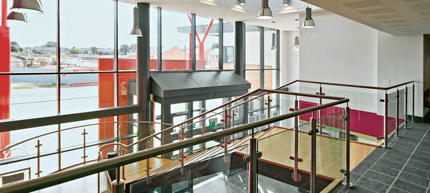
Investment in the primary care estate should focus on key public-facing areas such as receptions, entrance halls and waiting rooms, according to design experts.
Our job as designers is to make GP practices at best more economical and more professional, and to help doctors do their job better
Speaking at the recent Latest Developments in Primary Healthcare Property conference in London, leading UK architects called on designers to switch their focus from clinical spaces to communal areas in order to get the biggest bang for their buck.
The comments follow the announcement of a £1billion cash injection by the Government aimed at enhancing GP surgeries across England.
“Design is important,” explained Charlie James, an associate architect at GVA.
“Primary care facilities in the UK are largely defined by a stock of 1960s and 1970s cramped properties that are, on the whole, unfit for purpose.
“This is blocking clinicians and stopping services from meeting the current demand.
“The answer is design enhancements, starting with creating appropriate waiting areas and circulation spaces that are more vibrant and full of natural light.
“These front-of-house areas present easy wins. Beauty has a healing power.”
Improvements to design should start with main entrances, he said, which must be clear and inviting, leading to reception desks that are centrally located and offer good views around the building, helping with supervision and aiding orientation.
The reception desks themselves should be open, accessible and should not have screens dividing patients from staff.
“Receptions are often designed as barriers. Screens and windows can agitate patients,” said James. “
“When we design facilities, we tend to make desks lower and wider and we get rid of screens; making buildings much more welcoming.”
This approach was also supported by Steve West, director of the West Hart Partnership.
He said: “The first thing has to be a nice, welcoming reception area. It should be designed to help reduce anxiety, so patients should not walk straight up to a hole in the wall.
The first thing has to be a nice, welcoming reception area. It should be designed to help reduce anxiety, so patients should not walk straight up to a hole in the wall
“We design desks so they are quite high, with a drop element for disabled people. If desks are deep, then from a security point of view it is difficult for someone to reach staff or clamber over. Also, when a patient can see eye to eye with a receptionist, we find it eradicates some negative behaviour.”
To address privacy issues, there should be a room behind reception where private conversations can be carried out and confidential phone calls made.
“These things really do make a building work, particularly for patients,” said West.
Once patients have navigated the reception, the focus shifts to waiting areas, which should offer various places to sit, rather than straight rows of plastic chairs.
“It’s about balance,” said West. “You don’t want it to be too lovely or patients will be there all day, but waiting areas need to be open and organic.
“A selection of seating types is important and it is vital that patients can see where they are going, and where they have come from.”
Rather than large amounts of signage, the use of colour and branding can help to break up larger buildings, particularly those housing multiple practices, delegates at the conference heard.
“Visibility and wayfinding can be enhanced through design,” said James.
The answer is design enhancements, starting with creating appropriate waiting areas and circulation spaces that are more vibrant and full of natural light
“Many of the most-effective interventions are cosmetic or relate to the use of materials, but they help buildings to work smarter.”When dealing with clinical spaces such as examination rooms, treatment rooms, and consultation areas, considerations such as accessibility and infection control are vital, but these can be less intensively designed.
James said: “Clinical spaces absolutely need to be functional, but we are trying to create a less-clinical feel. This can be achieved through things like timber-effect vinyl flooring and more-traditional skirting solutions, with concealed plumbing units and integral blinds. This meets all the necessary criteria, but creates a less-institutionalised feel.
“Adding details such as colour can help to soften the environment further.”
West added: “We feel the money should be spent on the public areas, with flexible clinical spaces that can be used for a variety of different things.
“Our job as designers is to make GP practices at best more economical and more professional, and to help doctors do their job better.”

Communal areas such as circulation spaces and waiting rooms should be bright and airy
