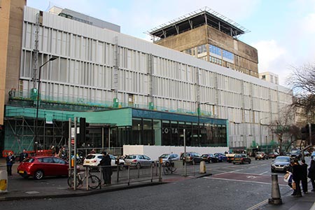
By this summer, the main facade of Bristol’s Royal Infirmary (BRI) Building, which was once voted the ugliest in Bristol, will be transformed by the addition of an elegant aluminium and glass skin.
The redesign forms part of a £92 million redevelopment of the hospital, which includes the new Ward block; Welcome Centre and Helideck.
The facade design, named "Veil", by Spanish architects Nieto Sobejano Architectos, was the winner of an international design competition held by University Hospitals Bristol NHS Foundation Trust, which runs the BRI.
Robert Woolley, Chief Executive officer at University Hospitals Bristol, said: "We believe that Nieto Sobejano's design strongly meets the original aims of the commission, namely to create a landmark building for Bristol that is welcoming and non-threatening. It enhances the streetscape and public realm, and reflects, through excellence in design, our reputation for clinical excellence.”
Enhancement of the existing 1970s concrete façade provides an opportunity to address number of environmental and maintenance issues as well as providing an opportunity for the Trust to develop and portray its brand to reflect the excellence of the clinical care it provides.
Andy Headdon, Strategic Development Programme Director at the hospital, said of the existing building: "At the moment, the concrete has got some problems. We are tidying it up and making sure it is safe. The new system will protect the structure underneath so it will not deteriorate. And there will be better natural ventilation in the hospital when the windows are open."
Nieto Sobejano developed the competition winning design for construction with CODA Architects the local architectural practice responsible for the redevelopment projects on the BRI precinct. CODA Architects Director Craig Bennett said: "We worked closely with Nieto Sobejano to ensure the original design intent was retained throughout the detailed design development and costing process through to construction”.
Nieto Sobejano’s approach to the project had a clear goal: the new facade should solve different problems with a simple and straightforward gesture, taking into consideration the existing building conditions, the new Welcome Centre addition, as well as the relation to the street level. The proposed concept addressed urban scale issues, visual and spatial connections, as well as technical and structural requirements.
Alexandra Sobral, Lead Architect for Nieto Sobejano said: “The new facade will not only define the hospital’s new image, but, as an expression of the city / scale duality, it recognises the role of architecture in the definition of the public space“.
The original vertical rhythm of the facade was accepted and considered as a starting point of the new solution. Then, the analysis of all the different layers (structural and material) became the instrument to develop the proposal and taking into consideration the functional needs.

To address the technical requirements a new building envelope comprising insulated aluminium rainscreen and integrated high-performance windows which combines all the technical requirements : a highly thermally efficient window system ; enhances the insulating layer ; increases its acoustical performance, and ensures complete watertightness.
The proposal also includes the re-cladding of the existent non-structural ornamental elements and of the concrete horizontal bands. Aluminium composite panels will be installed and fixed onto the head and base of the concrete plinth via a sub-frame system.
An integral lighting installation is central to the façade vision. To enhance the façade a new layer of light within the façade depth was created. As the architecture takes advantage of the previous non-uniform window arrangement, by changing it into an attractive random like pattern of vertical elements, the lighting proposal selects just a fraction those vertical elements to be highlighted with a vertical storey-height LED light strip.
This random-like design strategy suggests a kind of subtle dynamism that allows the lighting installation to implement a dynamic solution for special days or events, when a third of the lighting units will be on at a time in a continuous dimming loop.
The lighting dynamics, loop timing and fading sequences are extremely quiet, distinctive and elegant to complement the architecture of the new façade and to emphasise the extremely clear hue of the composite panels to bring into the night scene the feel of cleanliness there is during daytime.
To address the functional and spatial requirements, the small open garden which redefines the public realm to provide a new sense of welcoming and non-threatening environment mediates between the Queens Building and Upper Maudlin Street.
Nieto Sobejano "truly believe that the streetscape acquires a new reinforced profile embodying the engagement between the UH Bristol, the city and the local residents”.
Construction work started in June 2015 with repair and restoration work to prevent further deterioration to the existing concrete frame and prepare a suitable base for the new facade.
The new windows were then installed from the outside to minimise disruption to the hospital services within the building ; followed by installation of the new aluminium cladding system.
Made of aluminium and glass, the facade should be easy to keep clean - and will feature 500 tilt and turn double-glazed windows replacing the existing single glazing. When finished, the facade will be a modern skin over the top of the existing structure, made of powder-coated aluminium and glass.
The facade itself was completed in January 2016 and is being followed by the installation of the freestanding screen due for completion later in the year when there will be a formal opening.
The contractors completing the project are d+b facades, specialists in transforming old buildings. Pete Hillyard, d+b facades Managing Director said,”It has been a technically very challenging project, but has been delivered with minimal disruption to the hospital. The building has been transformed and modernised through sustainable refurbishment. It now has a visually-stunning maintenance-free facade, is energy-efficient, has much lower carbon emissions and will remain that way for future generations”.
