The abolition earlier this year of primary care trusts (PCTs) and the creation of GP clinical commissioning groups has already had a positive impact on the healthcare estate with the completion of the first phase of a flagship new medical centre in Hull.
Plans for Morrill Street’s New Green Surgery were first agreed while NHS Hull PCT was still operating. But, following the shake-up of the NHS and the switch to GP commissioning, the project became one of the first in England to be delivered in conjunction with local GP consortia.
And, according to the architects behind the scheme, working closely with the staff and patients who will be using the building has had a significant effect on the resulting building.
Alessandro Caruso of Gelder and Kitchen architects, told BBH : “The creation of clinical commissioning groups (CCGs) does seem to have brought a more commercial side to the NHS. Working with the CCG on this development there seemed to be much more interest in exploring the architectural possibilities.
Innovation
“The vision was always for a building that would deliver care for people, but at the same time it needed to be cost effective because of the cuts currently affecting the NHS.
“The whole experience has been very new in terms of the parties we were dealing with, but it has been excellent. It seems that for architects and other members of the development team, there is a new party coming to the table with a level of innovation we have not necessarily seen before.”
Once the PCT had been disbanded, the project was overseen instead by the new NHS Property Services organisation and Louise Ramsay, its local area team manager for North Yorkshire and Humber.
She said: “The project was already underway and onsite when the changes to the NHS took place. The people on the ground didn’t change and we managed to maintain the impetus of the project during a period of significant transition.
“The project was all about meeting the future needs of two practices and community services while still utilising the same site. It was a fine balancing act, but one where all parties have worked together within the new commissioning landscape to produce a building that is fit for the future.”
The £3.4m development is being delivered in four phases, with the first phase of the refurbishment of the existing building already complete, along with a new-build annex, which now houses one of two GP practices that will use the building. The facility will also provide space for community healthcare services.
This mix of use meant that the design of the building needed to allow for rooms to be multi-purpose and easily adaptable for the future. The lack of external space was also a challenge for the architects, who wanted to include some views of nature and the outside world.
Bringing the outside in
Speaking to BBH, Caruso explained: “We were involved, not only as architects and interior designer, but also taking on the landscaping, so we were able to approach the development in a holistic way, looking at all the spaces as a whole.
“With a building already being there, we needed to work with what we had to a large degree, making the most of the existing clinical space, but providing a little bit more scope.”

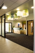
Due to the lack of access to outdoor spaces, the design eventually settled on a loop configuration set around a central courtyard. This meant many rooms benefit from outside views and natural light, although this is balanced with the need for clinical areas to have privacy.
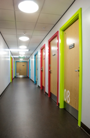
Colour has also been used to distinguish between different areas and to aid with wayfinding.
Soft greys, browns and greens, along with minimal use of some primary colours, has helped to break up the building and create specific areas for each of the different services.
“Access to nature has been done in a very controlled way. In a health centre people do not stay that long and they are not necessarily going to be looking to spend lots of time outside, but having the opportunity to view nature does have an impact on how people feel. At Morrill Street a courtyard was already there, but was generic in format and based in front of the main entrance. As such it was off the radar and was not used. Our design used the courtyard as a central part of the scheme, with large glazed windows seemingly bringing it into the building and the inclusion of some native species giving it an almost theatrical feel so people feel very connected to the outside world.” The revamped building is part single and part two storey, while the new-build element of the scheme is single storey.
“We wanted a building that respected the local vernacular and we believe that is what we have delivered,” said Caruso. “It is about improving the human experience. It is a combination of wanting to make spaces that are recognisable and welcoming and at the same time giving the impression that they are also spaces where people can relax.
Aung Nyunt, the centre’s paediatric audiologist, added: “We are so impressed with the new look. The layout is brilliant and it has been done to a high standard, with a great finish. The clinic and these facilities will be well used for the local community for years to come.”

Strong colours have been used to define specific areas within the new building
