Maggie’s is renowned worldwide for delivering first-rate cancer care and support across the UK and around the world.
But it is also increasingly becoming known for its design ethos and its reputation for bringing in top-level architects to produce eye-catching buildings that are helping to set a new precedent for modern healthcare environments.
And the latest centre to open is Maggie’s Leeds, which was designed by Heatherwick Studio.
A landmark site
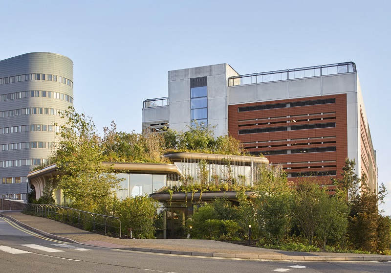
The 460sq m building is one of the charity’s largest developments and is located on one of the few remaining open sites on the St James’s University Hospital campus.
The sloping site was also one of the last areas of green space within the urban hospital setting and is on a key route into the hospital and, particularly, to the A&E department.
Healthcare staff are amazing and the tools and equipment are changing all the time, but so much more can be done to the actual physical environment and that is sometimes overlooked
The brief for the project, while open to interpretation by the architects, was to provide a welcoming place for visitors which offered a respite from the clinical environment of the main hospital.
It also needed to include a library, counselling rooms and informal seating areas.
And, absolutely key, was retaining the green space and a feeling of connecting to the landscape.
The Heatherwick Studio team, led by group leader, Mat Cash, achieved this by designing the building as a grouping of three separate ‘planters’ of varying sizes, the base of which encloses a distinct private place for visitors and patients to meet or to spend time alone, while also offering more-relaxed and approachable social spaces.
Each of the ‘planters’ has a counselling room and the three separate structures surround the kitchen, which is the ‘heart’ of the development and also houses the library and an exercise space.
Speaking to BBH this week, Cash said: “Maggie’s is one of the best clients as it allows designers to explore themes. And, while the brief was quite open, the charity wanted something that was an antithesis of the usual clinical, sterile medical environments.
“When designing healthcare spaces, there are so many different aspects to consider.
“The staff are amazing and the tools and equipment are changing all the time, but so much more can be done to the actual physical environment and that is sometimes overlooked.”

The site on the St James's University Hospital campus in Leeds was one of the few remaining green spaces, so the design aimed to retain and increase on the planting
Personal and private
The team designed a number of personal, private spaces as well as more-open-plan communal areas.
For example, there are two entrances; a main front door and a back entrance into the kitchen.
This means people can enter at their own pace and do not have to speak to someone straight away.
Cash said: “This was our first proper healthcare project and when we did our research, one thing that seemed to be missing when we looked at other schemes was the human scale and the use of sustainable materials.
“Obviously there are always going to be conversations around budgets, but for us it was about learning through conversations with Maggie’s and not just looking at patients’ physical needs, which can be met by the services it provides, but also their emotive needs. This meant how we designed the building was key.
“And it always comes back to the language of making it feel like a home and ensuring accessibility.
“Cancer is a very-emotive topic and we needed to provide spaces that help people to absorb and reflect on the information they are being given.
“We also wanted to building to feel like a home which visitors would be able to personalise over time.”
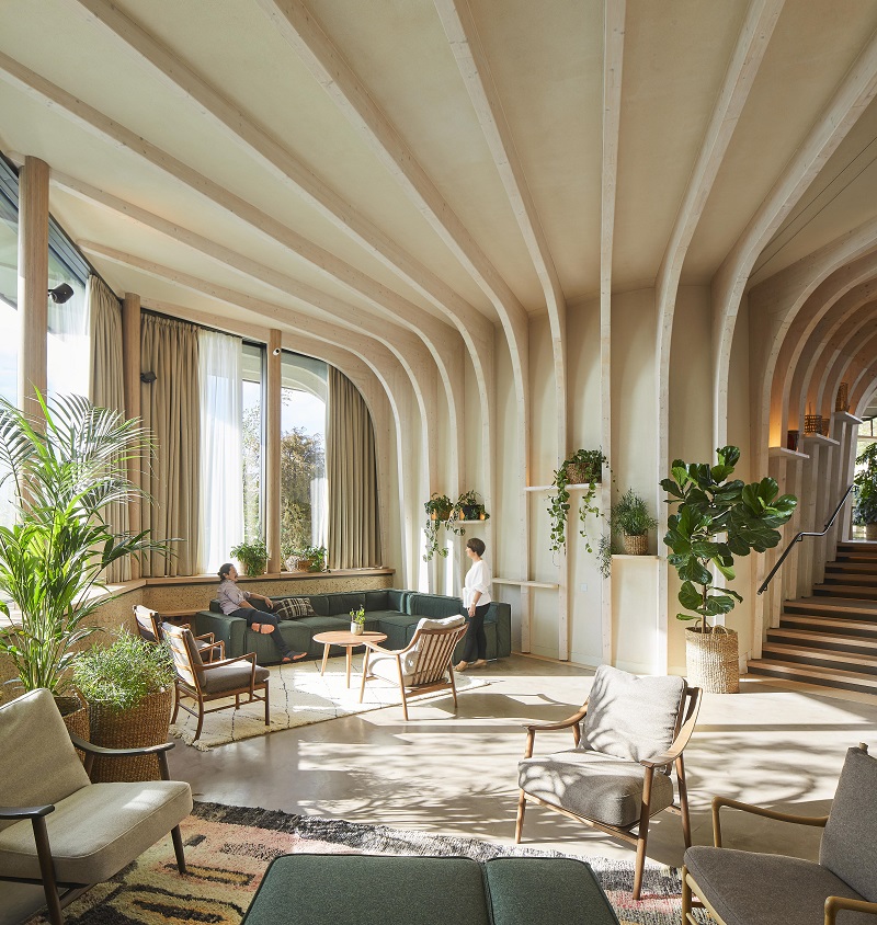
The interior of the centre explores everything that is often missed in many healing environments: natural and tactile materials, soft lighting, and a variety of spaces designed to encourage social opportunities as well as quiet contemplation.
Window sills and shelves are intended for visitors to fill with their own objects to create a sense of home and to meet the aim of providing the opportunity to personalise the spaces as you would do your own home.

The design is built around three 'planters' grouped around the kitchen, which acts as the heart of the development
Natural materials
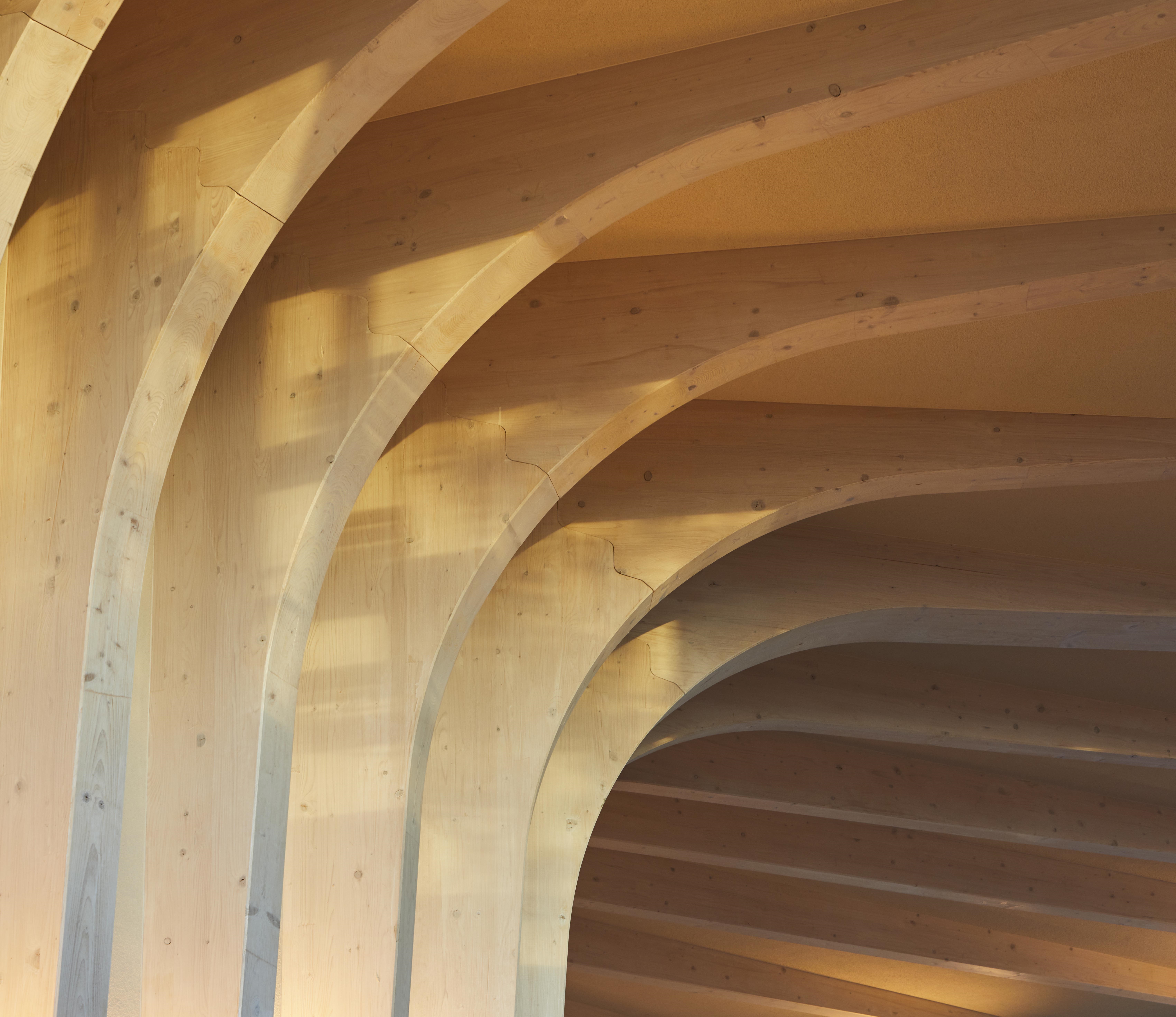
Heatherwick Studio also designed two tables, inspired by the building’s timber fins and built from cork and engineered beech timber, which reside in the heart of the centre.
And the use of natural materials is evident throughout the building.
The largely-timber structure, with its overhanging roofs, not only looks beautiful, but its form and orientation on the sloping site also improves ventilation and provides shading to help cool the building.
The use of timber also cut down on construction time as the buildings were pre-fabricated in a factory setting before being moved to the site.
Maggie’s Leeds has been a very special project for me and my team because we are convinced that there are kinder, more-empathic ways to design places that can have powerful impacts on the way that we feel
This took just three months and reduced disruption to the A&E access route.
Externally, too, there was a drive to maintain the green space and even to expand on it.
As such a rooftop garden was developed by landscape designers from Balston Aguis, inspired by Yorkshire’s woodlands and featuring native English plants alongside evergreen trees which will provide warmth in the winter months.
In total, there are more than 23,000 bulbs and 17,000 different species on the site.
And patients and visitors will be encouraged to help care for them.
Cash said: “St James’s is quite an urban hospital with few green spaces and they didn’t want to take the last one away completely.
“The idea was the build a building that would bring more greenery, both for visitors and those who walk by as it’s on one of the main routes into the hospital.
“That meant it was very important how it looked on the outside too.”

As well as being more sustainable than traditional building materials, the use of timber also kept work and disruption on site to a minimum as the buildings could be prefabricated in a factory setting
Setting a benchmark
He concluded: “We have been very interested in healthcare for many years and while we get involved in lots of different projects around the world, this was our first scheme in this sector.
“Healthcare is such a fascinating area, with so much complexity, and we were thrilled to get the opportunity to explore the conversations we had been having within the practice for years.
“Cancer, in particular, is a very-emotional topic and we need to provide spaces that meet their needs in all respects.
“We think Maggie’s Leeds does this and are really proud of the building.”
Thomas Heatherwick, founder of Heatherwick Studio, adds: “It’s been a tremendous experience and honour to design the Maggie’s centre in Leeds.
“Our aim was to build a home for people affected by cancer that would be soulful and welcoming, unlike other typical clinical environments.
“By only using natural, sustainable materials and immersing the building in thousands of plants, there was a chance for us to make an extraordinary environment capable of inspiring visitors with hope and perseverance during their difficult health journeys.
“Maggie’s Leeds has been a very special project for me and my team because we are convinced that there are kinder, more-empathic ways to design places that can have powerful impacts on the way that we feel.
“This is particularly important in the design of healthcare environments, but is so frequently overlooked.”
